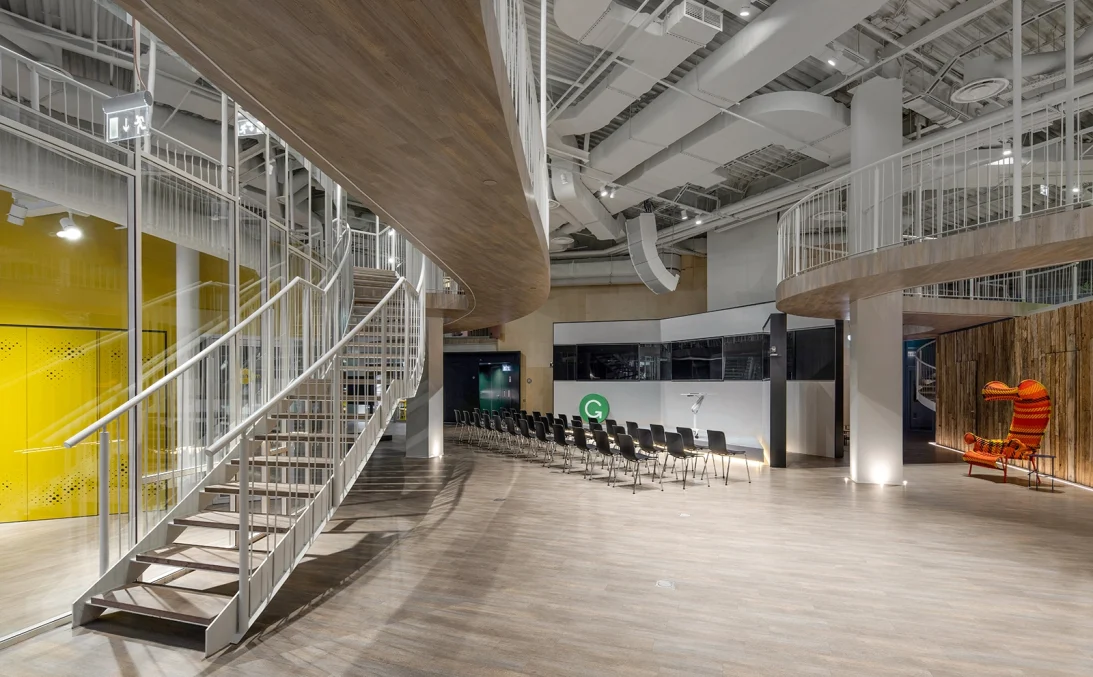
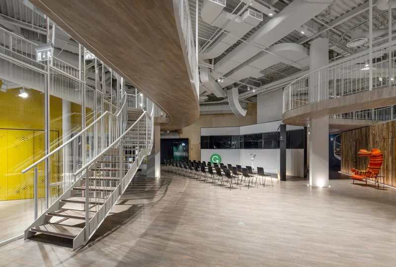
Leading architecture and interior design firm, balbek bureau, was chosen to design an entirely new space for one of Grammarly’s largest offices. This large, forward-thinking corporate space is located in Kyiv, Ukraine and hosts 150 employees. We connected with the lead designer, Andrii to discuss the details, challenges, and why they chose SketchUp for this project.
Give us some background on you, your team, and the types of projects you work on.
I graduated from the Kyiv National University of Construction and Architecture where I earned my architecture degree. After that, I started working at balbek bureau as an architect. balbek bureau works on various types of projects. However, we prefer the corporate and commercial sector; though, we are not limited to a particular type of building or a specific style. In line with this scope of work, we recently completed the new Grammarly office in Kyiv.
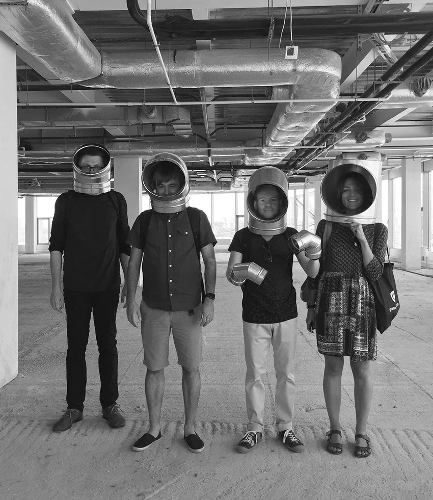
Our design team consists of 40 people, including architects, designers, visualizers, and project managers. We work in creative teams where there is a team lead architect, architects, designers, and a project manager. In general, each team consists of three to ten people. Because balbek bureau provides interior design services for a wide range of industries, the creative teams are formed according to the specific type or style of the project. For example hotels, large office spaces, medium-sized offices, cinemas, gas stations, beauty salons, showrooms, “adaptive reuse”, and restoration projects.
For those who are not familiar with Grammarly, who are they and what do they do?
Grammarly is a global company with offices in San Francisco, New York, and Kyiv. They operate 24/7 and are used as a digital writing assistant by millions of people across the world. Grammarly uses a plethora of IT devices and utilizes a high volume of communication and data exchange, both within individual and group settings.
What was the reasoning behind building a new Grammarly office? And did they have any requirements?
The Grammarly Kyiv team has grown significantly over the years and in 2016, they had outgrown their space. They needed to move to a larger space to accommodate all of their employees and operations. With that, Grammarly required a variety of spaces for different activities, including:
- A large conference hall with a seating capacity of 150 people
- Multiple, smaller meeting rooms equipped with quality audio and video technology for conferences across the globe
- Reception zone
- Soundproof recreation room
- Canteen for employees
- Nap room
- Several lounge zones
- Restroom areas
Other requirements included eco-friendly materials, a warm color palette with a homely feel for the interiors, and the adaptability and flexibility of the space. Our team was responsible for the location of the office, office layout, interior concept, and all of the furniture, fixtures, and equipment.
What was your design process for the Grammarly office?
We started by choosing a location for the new office. We had to choose between five different locations with seemingly different layouts. The winner was Gulliver business center in the city center. Since we didn’t have much time for the design project, the decision was to do all visualizations using SketchUp only, not using 3DS Max, as we normally do. We saved about three to four weeks using 3D models to get approval on the design from the Grammarly team.
After that, the design project was delivered in the short term for all engineering work. While choosing furniture and decorative materials, we were also checking all engineers’ layouts and drawings in accordance with our design project. The construction phase lasted for about one year.
Did you run into any challenges? If so, what were they?
Yes, the design was very unique to the space, so we encountered many challenges that we worked through including creating an open working environment with two levels, a suspension bridge, a nap room, and incorporating natural light and other elements to create a work-friendly environment.
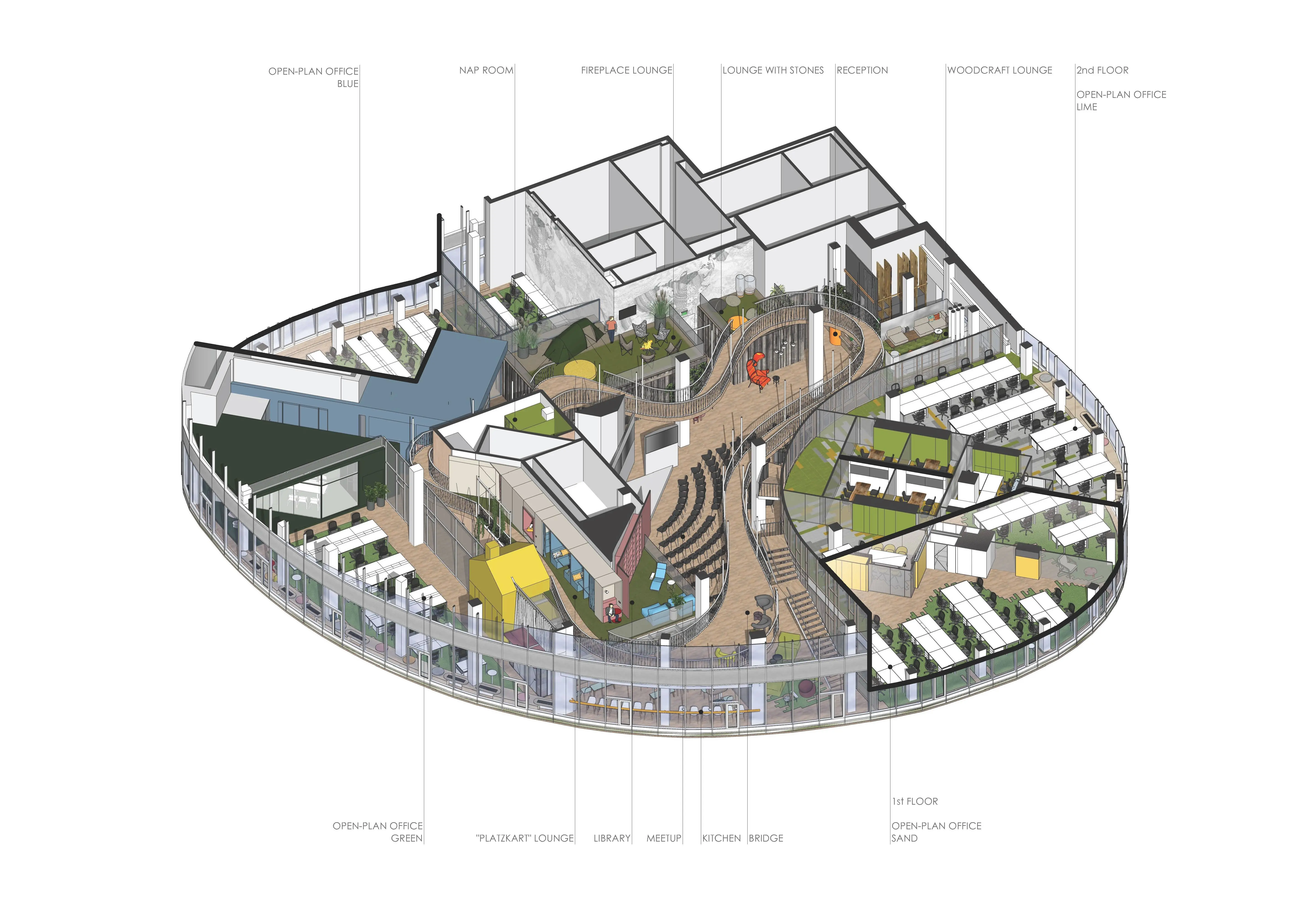
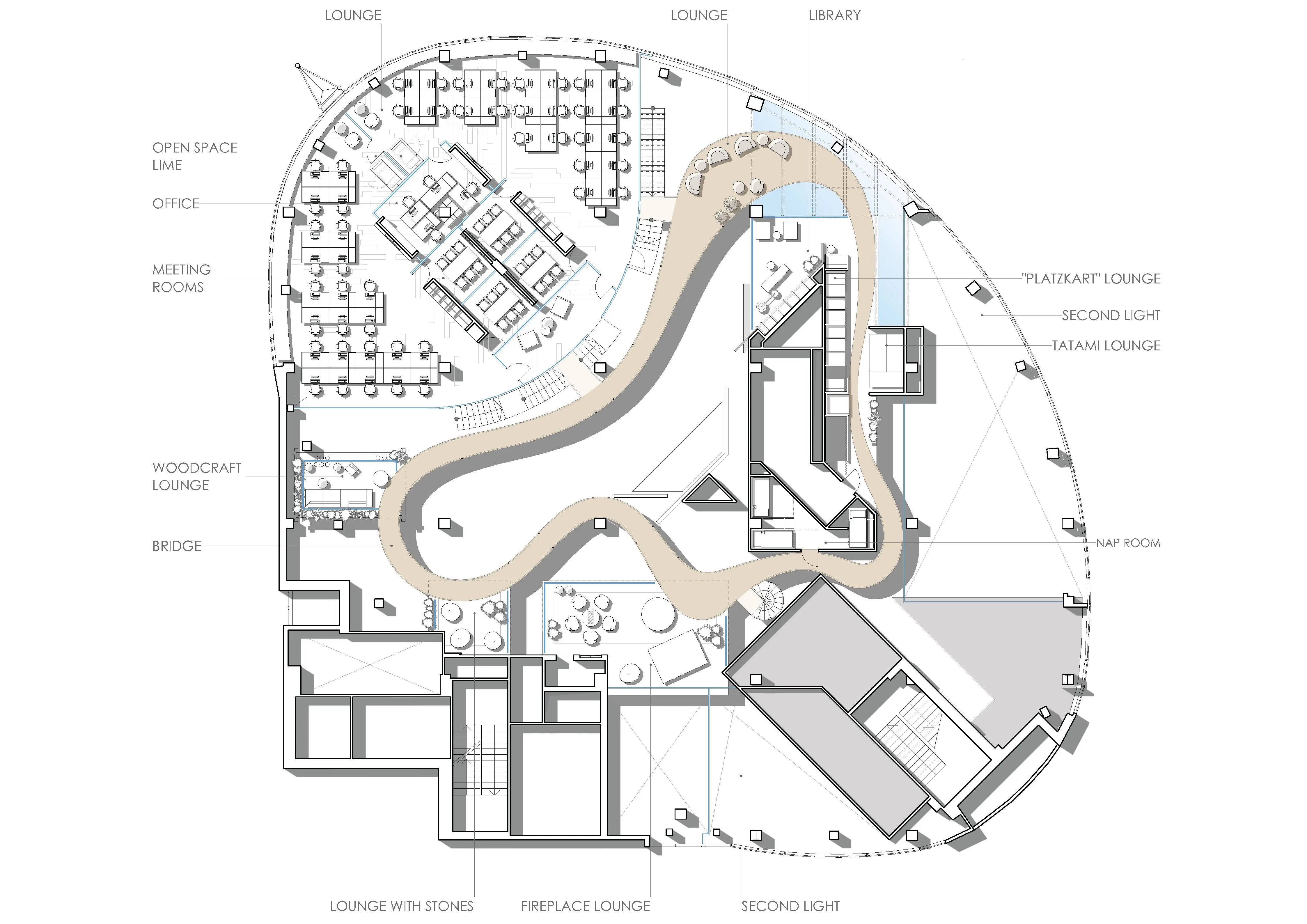
The original office area consisted of only one level and a mezzanine of 300 sq. m. To use the space at its maximum, we divided the office area into levels with a suspension bridge and connected it to an open staircase. We also expanded the mezzanine area up to 450 sq. m. This created a siloed work environment for employees. After meeting with the Grammarly team and understanding their needs, our layout idea was to have a meet-up zone on the ground floor where everything would be centered around and would make employee interaction a focal point. The meet-up zone was essentially the “heart” of the office and had six open-plan working zones surrounding it with soundproofing for privacy. We had to make sure this separated the working spaces but also allowed for a sense of “openness”. To do that we developed a radial curve to separate the working areas, and connected the first and second floors with an open staircase.
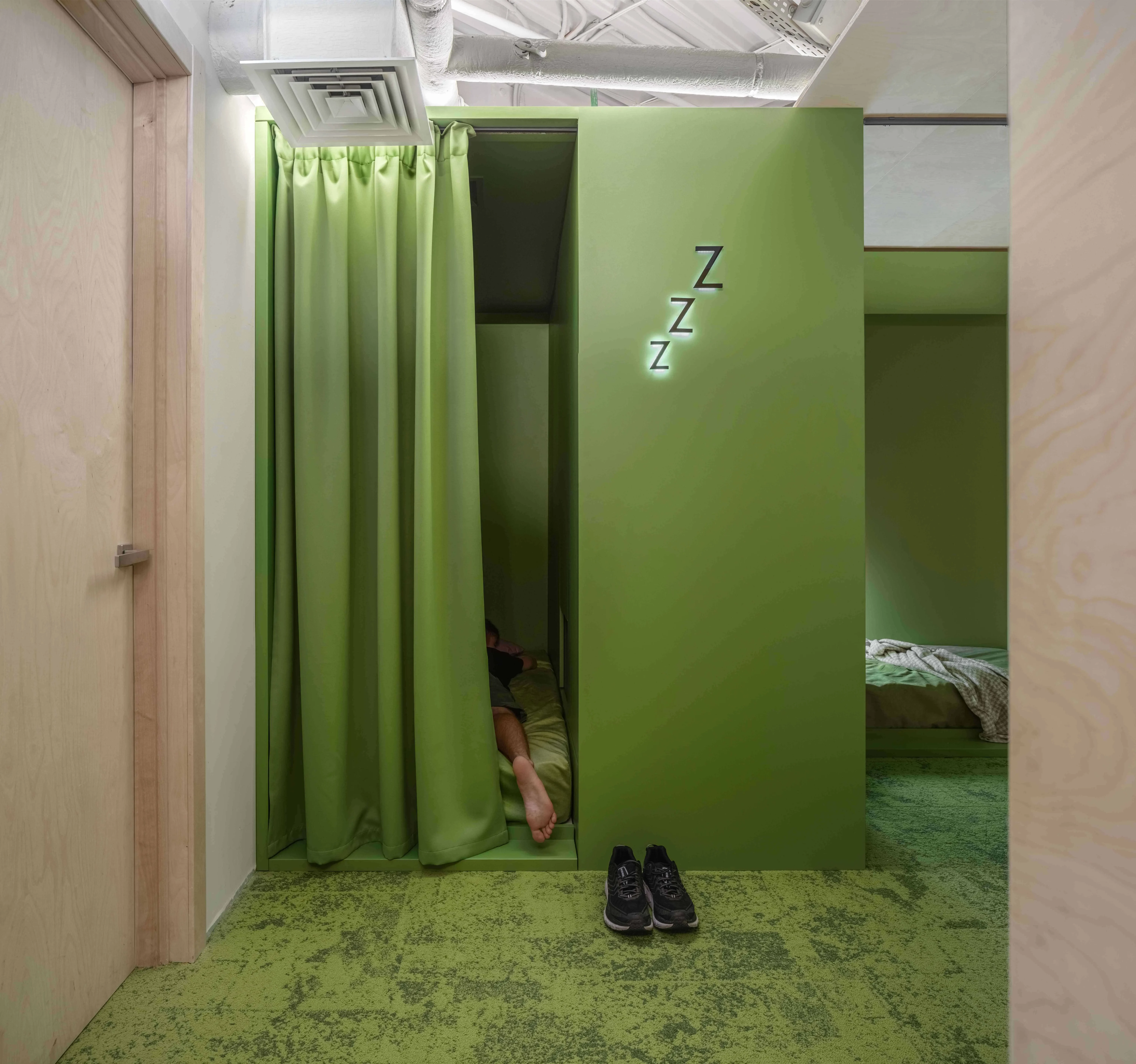
The nap room was another new design element for the building. This room had to be quiet and comfortable so employees could rest, relax, and recharge. We designed a space for three napping blocks. Each block had dark curtains to block out any light and a sensor under the mattress that would alert people if the room was occupied so people would not interrupt.
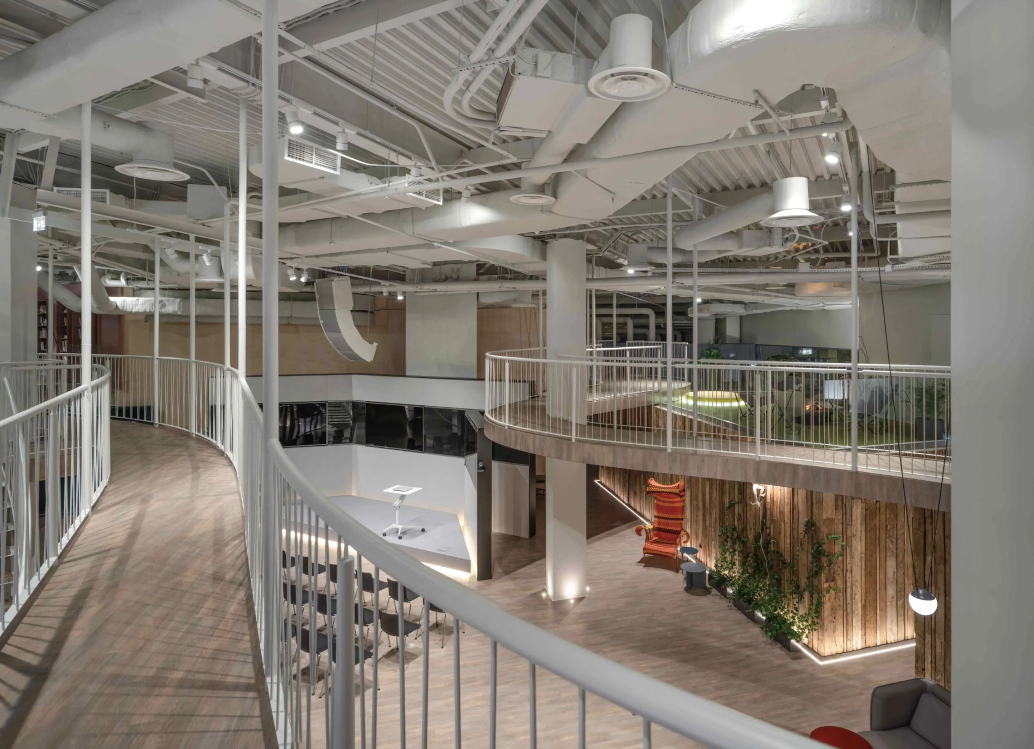
Another tricky area was incorporating the suspension bridge. The length of the bridge is ninety meters, it loops around the office in a gentle curve, overlooking the entire office, and expands slightly to accommodate rooms in its path. The bridge has no ground support, it is merely suspended from the ceiling. In order to keep the thickness of the bridge to a minimum, we passed the sprinkler system pipes under the main floor, and incorporated their fragments into the body of the bridge, blending them with the bridge’s structural elements.
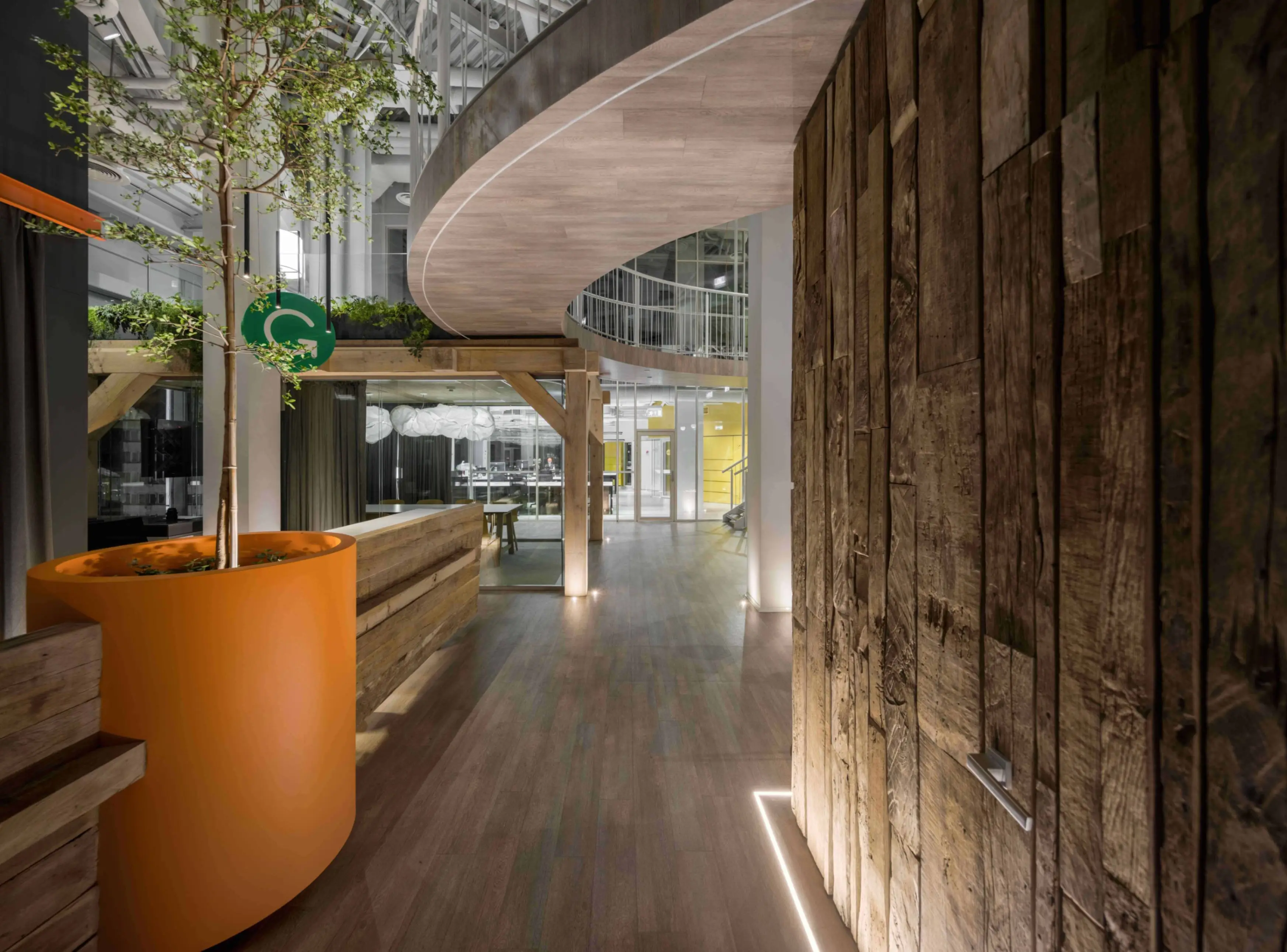
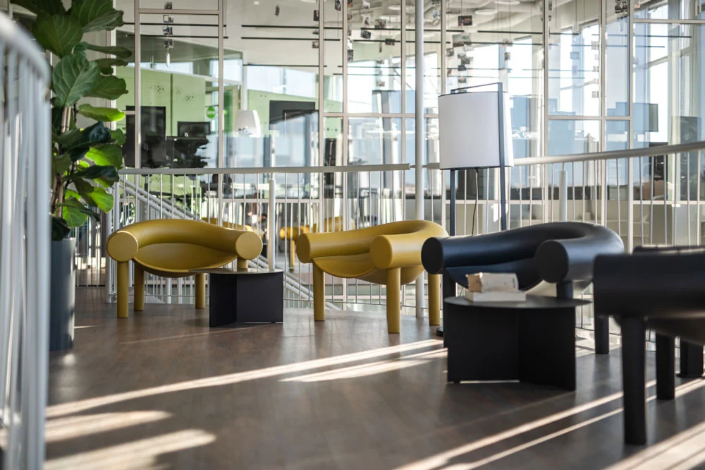
Other challenges included the use of eco-friendly materials. We had to creatively think of ways to reuse these materials throughout the office space. This also included a natural light requirement to help create a positive work-life balance for the employees and contribute to a higher level of comfort and efficiency.
For the natural light requirement, how did you know how much natural light would help with comfort? Did you analyze this?
Guided by the knowledge of the environmental design code of urban commercial buildings, a perimeter depth of 6m, or twice the floor-to-ceiling height, can be potentially daylit. Thus, buildings deeper than 12m require more artificial light. The Grammarly office in Kyiv is 8.8 m, respectively; therefore, we placed the working areas closer to the source of natural light and the auxiliary rooms deeper into the office where they were supplemented with additional lighting.
Why did you choose SketchUp to design the Grammarly office?
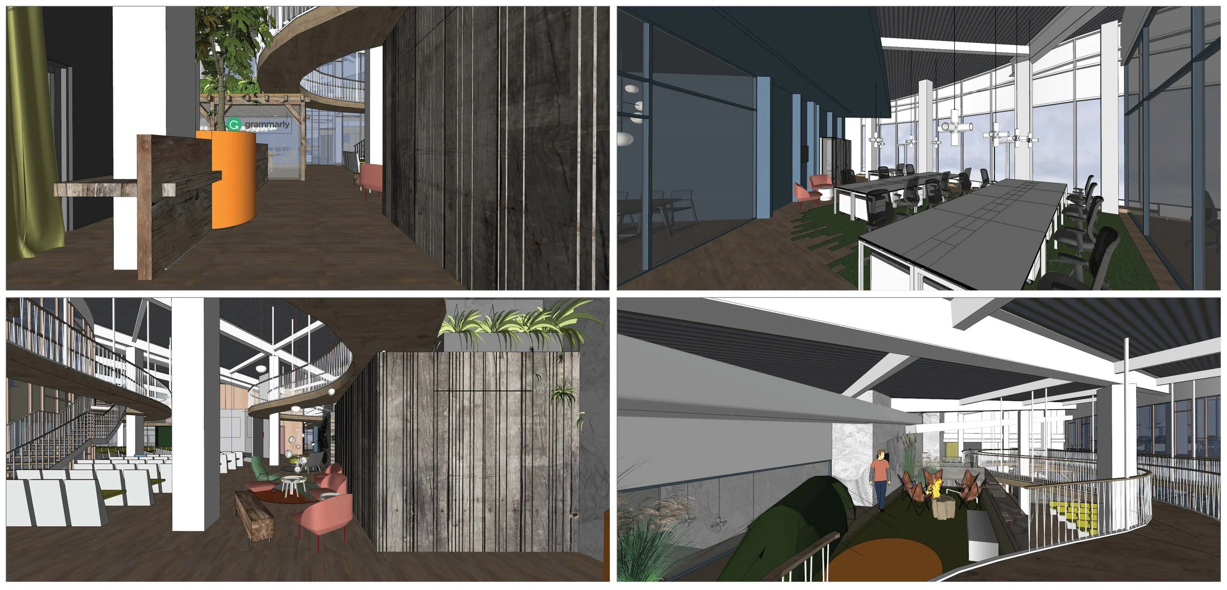
We chose SketchUp due to its ease of use and speed. This project was under tight deadlines and we needed a tool that would allow us to work fast. Normally we would incorporate 3DS Max, but there was no time to do that. So we created everything in SketchUp—from the original design to the nitty-gritty details including textures.
What was your workflow in SketchUp?
First, we started designing the 3D models using measurements on site. After some work on the design construction, we moved onto smaller things like incorporating furniture, lighting, and textures. To save time, we used models from 3D Warehouse or from manufacturers’ websites. Our favorite part was the presentation of the model. We used cameras and scenes to showcase funny things, like a birthday cake in a table drawer. Also, we did not use any extensions. This was all native in SketchUp.

What are some benefits of using SketchUp in a corporate architectural project like Grammarly
SketchUp allows you to work with a big, complicated model in one file, not dividing it to smaller ones. I also like SketchUp Viewer because we can easily present our designs to clients on their laptops.
How did you manage the SketchUp model size and performance with such a large file?
Actually, it wasn’t a big deal. We kept everything in one model because the office had an open-plan layout. Based on this spatial concept, there were a minimum number of polygons, and all the interior details were in the separate files. The invisible elements weren’t included in the general SketchUp model.
How did team members collaborate on the same model? Were there challenges?
I worked on the general SketchUp model and assisting team members helped with the detailed objects in the separate files. It made our workflow easy and very efficient which helped with the tight deadlines we were under.
Have you used SketchUp in any other projects? If so, what were they?
Yes, we use Sketch Up in most of our projects. The latest include:
- Bursa hotel
- 4CITY
What’s your favorite SketchUp command?
“Flip”
Start modeling with a free 30-day trial or pick the right SketchUp subscription for your workflow.
Credits
- Architecture and interior design firm, balbek bureau
- Architects: Slava Balbek, Andrii Berezynskyi, Anastasiia Marchenko
- Project manager: Borys Dorogov
- Client: Grammarly Kyiv
- Photography: Andrey Bezuglov, Yevhenii Avramenko
